Here’s what we learnt from more than two years of continuous online checkout improvements.
Website optimisation is a constant progression. Not with the intent to squeeze every last penny out of people, but a progression from ‘complex’ to ‘completely straightforward’.
There is no point putting in the hard work to market products or win over customers, if we were going to make it disastrously hard for them to purchase what they came to us to purchase!
Having a difficult, confusing, or down right rubbish checkout system is one of the most frustrating things to put on your customers. It’s as if you’ve followed a customer around a store and tended to their every need, then when they come to pay for their selection, you’ve ignored them, baffled them, and made it hard for them to simply pay and walk out with their purchase.
We don’t want you falling foul to some of the mistakes that are so prevalent in the online marketplace, so here are selection of the things we learnt over the years about how to make your online checkout system as simple and sleek as possible:
How did we go about this?
There are 3 key recurring things that we keep in mind during the process of optimising not only our website, but also our checkout pages. They are:
- Know the customer
- Build to the customers needs
- Test and analyse
1. Know the Customer
We decided to create a profile around an ‘average customer’: Joe Bloggs.
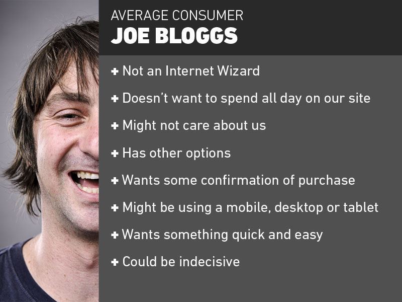
Now, what do we know about Joe Bloggs?
- He isn’t an internet wizard – don’t pretend he is
- He may have all the time in the world, but that doesn’t mean he wants to spend it on our site
- He might not care about us as much as we want him to (We could just be any other company to him, not necessarily one he’s familiar with or has any loyalties to)
- He has other options if we make things too long-winded
- He wants some form of reference to his purchase after he’s made it
- We can’t presume he’s using a desktop with a cushty 26” monitor, or even a computer for that matter.
- He wants to spend more time shopping than checking out
- He might be indecisive
2. Build to the customers need
Now we have a brief!
Instead of shots in the dark, guessing and hoping what we change is beneficial, we have a rough brief for what we need to streamline our checkout process. Which is:
- Quick, simple, easy to use
- Prompts and guides
- Cross device functionality
- Keep in touch after the process
- Give people options*
- *But not too many options
Great. Now… how did we make this short list into a reality?
Make all actions clear
When someone adds something to our basket, we don’t want them having to glance around the screen or jump through hoops to see what they’ve added. We found that people would often add something to their basket, go to the basket to check, then go back to shopping.
Whilst this might be good for our pageview and bounce rate metrics, it’s absolutely not the experience we want our customers to have. Making every action clearly register, we managed to streamline customers shopping trips. Take the below image for example:

Here’s what used to happen:
- Customer clicks add to basket
- Item goes to basket with little visual feedback
- Customer either checks the tiny basket information box in the top right, or clicks on the basket to double check
- Customer is happy their item has been added and either checks out or clicks back to continue shopping.
This doesn’t seem too long winded, but we wanted it better.
Here’s what happens now:
- Customer clicks add to basket
- A popup appears for ~8 seconds showing their basket with the option to checkout or continue shopping
- Customer either checks out, clicks continue shopping, or does nothing and the popup disappears.
Much better.
Make a friendly form
KISS. Keep It Simple Stupid. We kept repeating this to ourselves as we designed our forms. They shouldn’t be too long, or so short that they don’t gather all the correct information. Finding a balance is key.
We’ve recently written about Decision Fatigue, which plays a part in whether people decide to purchase or not. Here’s a little snippet from that post, specifically on ‘Decision Avoidance’:
“The logic behind this is that people who are overwhelmed by a lot of choices are less willing to buy anything at all. therefore, by that logic, people who are given fewer choices find it easier to commit to buying something. Since the decision of what to buy is a comparison of options – the less there are, the fewer mental comparisons the buyer must do. This is a reminder of the need for a healthy balance between choice, and refinement.”
Another element of keeping forms friendly and frustration free, is highlighting what might be wrong in a customer’s details, before they hit proceed. There’s nothing more frustrating than filling in a form, clicking next, and having your information be deleted, with error messages popping up in various places. We know that, and so do our customers.
One way we tried to solve this was with real-time feedback on the fields. See below:
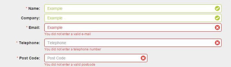
If the information our customers have filled in is valid, then we highlight it with a green tick as soon as they click out of the box. If it’s wrong, we let them know before they click next, and tell them example what’s required of them. It saves times, it saves frustration, and it ensures that every time a form is filled in – it’s got the details we need to process the order smoothly.
Offer a guest checkout
Whilst we would always prefer people to create an account with us so that we can make future checkouts much faster for them, not everyone wants to do that. Offering a guest checkout allows people to continue without putting up a barrier of needing an account.
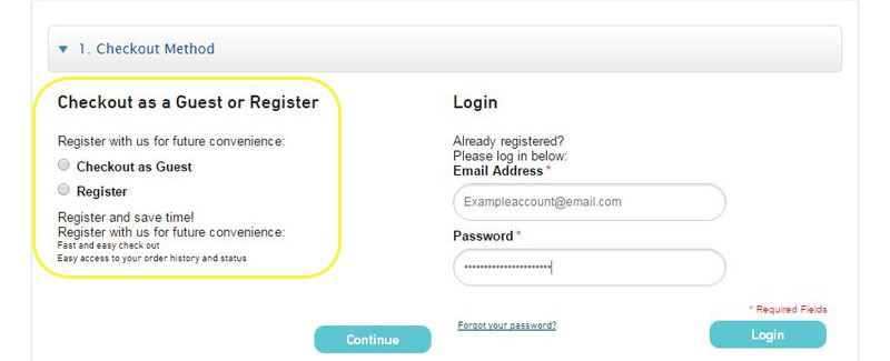
Something we learnt during this feature implementation was that most people would opt for a guest checkout because on the surface it seems to be the quicker option. That’s why we implemented some key features of creating an account:
- Save time for future orders
- Streamline the checkout process
- Access order history and status
With this new found information, the balance of guest checkouts/registered users normalised again.
Make use of Autofill
When it comes to filling in customer details, the easier we can make the process for them, the better. One way of doing this is using ‘Autofill’. Certain browsers support the ability for users to save their details for use in online forms, so that when you start typing one field, it will automatically fill in all the others fields it can to speed up the process:
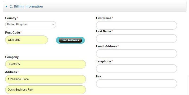
Above is an example of our form auto filling the address fields, just from a user putting their postcode in the second box (Of course, we also offer a ‘find address’ feature, if autofill is not an option for the customer.
For the most part, autofill “Just works” due to clever mapping on the browsers behalf, although there’s a detailed post on Google Webmaster Central around this topic – if you fancy some ‘light’ reading.
Be transparent with their progress
Keeping customers in the dark about their progress through the checkout process can work one of two ways:
- They could exit the session because they feel like it’s a never ending process and they don’t have time for it
- They could continue anyway because they have all the time in the world
We found that option 1 was the most common. So, we implemented a simple and sleek progress bar across the top of our checkout so customers know exactly where they are in the process at any given time.

Of course, this doesn’t completely put an end to people dropping off mid-checkout (There’s always the possibility that they see all the steps and decide that it looks too long winded), but for the most part, it removes doubt from the decision of whether to X out or not, and that’s always a good thing.
Confirm their order
In much the same way it’s important to let our customers know when they’ve added something to the basket, it’s equally important to confirm that they’ve made a purchase.
It needn’t be anything fancy or too complex (at least to begin with). Just a note in an email that confirms to the customer that they have ordered X item, at X cost, and some information about delivery or contact information for our company, should they wish to follow up with us.
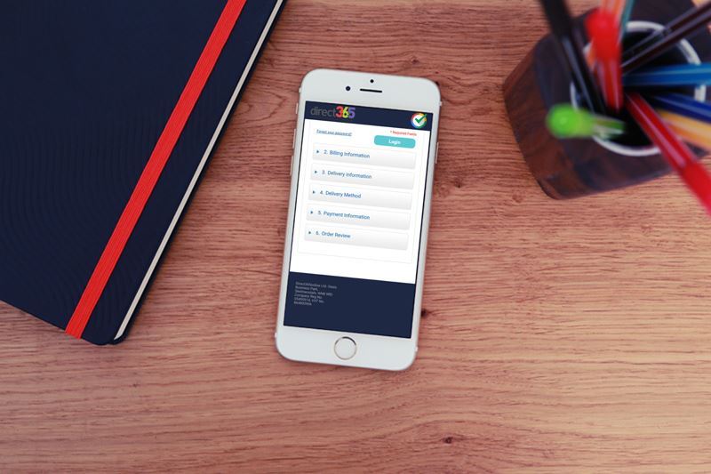
Work on Mobile
How our customers choose to shop shouldn’t restrict their ability to shop altogether. Making the entire checkout and shopping process work just as well on mobile and tablet as it does on a desktop was a priority for us, since the market is shifting more and more towards people using alternate devices to purchase other than their clunky desktops.
We haven’t got round to smartwatch checkouts yet, but we’re not pencilling that as a tp priority just yet.
Keep in touch
Previously, we used to make a sale and that would be that. Done and dusted. Filed away. Now, we use this order, and customer information, to try and personalise and improve the experience our customers receive.
“Don’t be a stranger” we tasked ourselves. One way we tried to improve our customer experience was by the use of a trigger email, that aims to offer a personalised and customer-focused follow up.
For example: If a customer buys a pack of 20 toilet rolls for their business, with 50 employees, we know that in a few weeks time they’ll need to restock.
We also know that if a customer buys a defibrillator from us, they might need training for the unit, or new pads in 2 years time. This intelligent follow up helps to make the whole process of buying from us much more end-to-end (Excuse the buzzwords) and less one-click-wonder.
Have an Option B if they abort
Prepare for the worst. We know that saying is usually reserved for more extreme cases, like packing for a wilderness trip to the south pole, however – in our case, the ‘worst’ would be someone clicking X before they’ve purchased a product.
For whatever reason; time, cost, delivery, an office fire – people abandon their baskets.
How can you combat this? A friendly reminder. Implementing an abandon cart email, that reminded people that there order was still saved should they wish to return to complete it worked wonders for helping to convert seemingly lost customers. This is obviously a good thing for us, but the real benefit is relayed to the customer, believe it or not:
- They have an email reminder of the product and it’s price
- They know we have it saved if they change their mind
- They have a reference if they wish to return to purchase, instead of having to trawl through out whole site again
These customer focused benefits are what help to turn X’ers into purchasers
3. Test and analyse
Optimisation never ends. That’s the title of our Developers debut album.
Once we understood the customer’s needs and built a form that caters towards them, we didn’t sit back and expect the benefits to be eternally rewarding. We know that needs change, technologies advance, and UI norms progress.
For that reason, it’s key to always test and analyse your work so you can see what works and what doesn’t and find suggestions for future improvements.
How do we do that?
Check for drop offs
What we use: Google Analytics
Seeing where people are exiting your site can be a good way to detect where errors are, or where improvement is needed. Check the conversion path to see where the most people leave your checkout process – go to that page and figure out what might be causing their exit. Could it be too many fields? Website errors? Hidden costs suddenly presenting themselves? Delivery information and timing? It could be any number of things, but knowing where to look is a great start.
Check customer interaction
What we use: Mouse tracking technologies
Looking at what our customers are doing with their mouse helped us figure out whether our buttons were in the right place and easily distinguishable as buttons, amongst other things. Getting a first hand view of the problems or decisions our customer makes can be very beneficial when it comes to experiencing problems from another perspective. It can be all too easy to glaze over minor problems, when you were involved with the creation of something.
The same way you should get someone else to proofread your own writing!
A/B Testing
What we use: A/B Testing Tools
Making changes isn’t always final. A drop in sales because of a bad change stays on the record though. That’s why it’s good to split test any changes you make. If you want to change the button colour to green instead of red to see if conversion rate increases, splitting your traffic to test the results is much safer than rolling out the change fully.
There are countless methods you can go about planning, developing, testing or measuring your checkout. One thing that remains constant is the need for it to be ongoing and flexible. You don’t necessarily need to be constantly ahead of the game, at the cutting edge of modern. You just need to make sure you’re not flagging behind in a giant game of improved customer experience.
Back