As an online business, we can often get engulfed in a world of conversion rates, landing pages, pay per click adverts and bounce rates. Whilst this terminology might lend itself more fluently to the online marketplace, the principles just as easily can, and almost certainly should, translate into an offline setting.
As consumers, we all like to make lists prior to entering a store but often exit with much more than we initially intended – whether we’re looking for a new pair of jeans and leave with two pairs and t-shirt, or venturing in for eggs and milk and leaving with £100 worth of groceries and foods on offer, the art of advertising, layout, first impressions, cross-selling and customer journeys are all key tools in the offline arsenal. This is something that big retailers use to death, and you can to.
Here are our tips on optimising your store layout to help increase sales and customer satisfaction:
Presentation is key
Let’s start with the basics – if you have a scruffy looking unkept store, nobody is going to want to go in, or trust that the quality of products inside is up to scratch. In the same way that you would avoid a restaurant with rats running around the outside, you’re not going to want to shop in a store with dirt on the windows or graffiti on the walls.
What can you do?
Spend some time cleaning up your store to get it looking like new, then schedule in some time to do regular checks and cleans of your store. Whilst it may seem like time spent washing windows is time lost on the till taking sales, you’ll see the difference when your store, and it’s reputation, are gleaming.
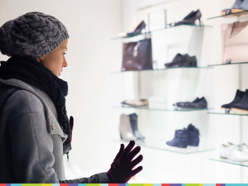
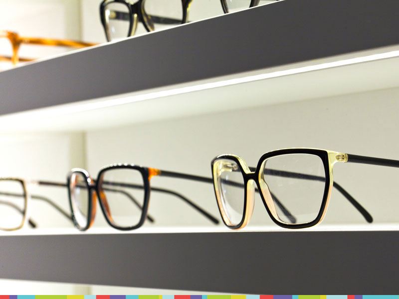
Work on your window display
Not every store is gifted with high footfall locations or full sized window displays, however any window space is room to show off your store and its contents. A lot of retailers opt to use their windows as a way to allow customers to look into the shop, other than using them as an appealing display to show off a selection of products, colours and themes.
What can you do?
Work to create a simple, appealing and eye-catching display. Look to use a single colour and base your theme off of it – think about the image of your store or seasons, when deciding on a colour (Our understanding colour and its meaning guide, will help you! Read here). Don’t over clutter the display, as this makes your store look cheap. Instead, try to space out some of your most appealing products to give a feeling of luxury and exclusivity.
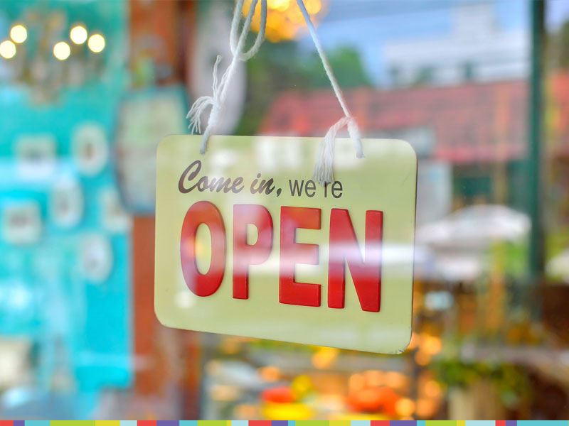
First impressions count, especially in your entrance
A problem that many businesses have is, as mentioned in the introduction, customers coming into their store knowing exactly what they want and where to get it, therefore making a beeline for it. When a customer enters your store, you want to present them with something eye-catching, fresh and interesting. Something that will take their mind off their path towards a specific product and encourage them to stop and interact with your display.
What can you do?
Create a doorway display that catches the eye, and gives customers something to interact with. This doesn’t have to be something elaborate or flashy, and could be as simple as an unboxed product, a flower display, a large poster or even a little table with a few chocolates or edible treats on, as a little gesture of goodwill to your customers. If it makes them stop, think, interact, orcatches their eye (See, it works) – you’re doing the right thing (Within reason, of course!)
After you’ve made a first impression, lead them to turn left
Yep, seriously. Studies show that as people enter a store, they will naturally look left, then right and in the majority of the world, naturally prefer to veer towards the right, and browse the shop counter-clockwise. In the UK, Australia and Japan, however, shoppers prefer to go left and traverse a store clockwise. This is most likely because of the side of the road we drive on. We turn left and follow the wall around the store.
What can you do?
You don’t have to steer your customers around your store like sheep, but you can entice them in certain directions with vibrant displays, encouraging smells or even something as simple as making a certain direction the easier or more spacious option, which we will naturally lean towards.
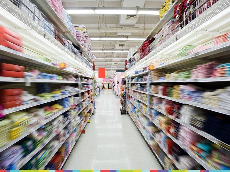
Avoid dead ends or empty walls
When talking about online sales, we often refer to the ‘customer journey’, which is exactly what it is. In store, this is even more accurate, as you guide your customers around your store. Dead ends at the end of an aisle or a blank wall create an interruption in a customer’s flow around your store and brings them out of the immersion like a car crash. Similarly, blank walls are wasted space, which take people out of their shopping experience and into the reality that they are in a walled store.
What can you do?
Create a path for your customers to travel round. Make sure that in every direction there is something visually appealing, or relevant, to look at. If you have an empty wall visible in your store, even if it’s behind the counter, fill it with products for cross-selling, a splash of colour or even some artwork. The stronger a visual journey you can take your customers on, the better.
Create a touchy-feely environment
A lot of big stores will present products to you that are unboxed, and in standalone displays – this is because products that we can, and do, touch often leads to a purchase. Going on from this, people are more likely to touch things and pick them up if your displays are little more disjointed and random – consumers often do not like breaking organisation or ruining a perfect display.
What can you can?
Offer certain places in your store where customers are led towards picking up a product. A standalone display of an unboxed product, or even a lesser organised shelf with product strewn across it, of which people feel much more comfortable picking up and sifting through. Don’t be afraid to break out of organised perfection and put things in front of your customers. What’s a few fingerprints on an item if it leads to more sales?
Break it up
I know – we just told you to create a flow and guide your customers around your store, and now we’re telling you to break it up. Confusing? Not really – if you create too much of a flow, or path, people will tend to fly round it like it’s a predetermined race track and ignore the majority of your items, until they are forced to stop, turn, or interact, at which point they’ll zone back into focus on the products.
Long, uninterrupted aisles often don’t grab people’s attention, since many consumers simply lose interest by the time they get halfway down, or are so overwhelmed by choice they tend to focus on one product, instead of browsing and taking in the choice.
What can you do?
Try not to make your store one single unbroken funnel to the exit. Take your customers on a journey, but one that encourages them to stop and think – one that makes them engage with your products, and not simply sail through. You can do this by putting signs or displays in the way of a customer’s path – not obtrusive, but noticeable and eye catching.
Put on the Greatest Hits
Music is popular in stores, and varies from store to store how long, or what genre, the music is. The reason for it is to create a feeling or emotion, as well as to better relate to the target audience of the store. A popular, youthful, store might play pop to appeal to their target market, whereas a quality jewelers might throw on a bit of jazz to exude luxury and tap into a slightly older market. Statistics show that faster music encourages people to path through a store quicker, whereas slower music has the opposite effect.
What can you do?
It’s not hard to quickly hook up a set of speakers, and subscribe to any number of music streaming services to start playing a spot of music in your store. The tricky part, however, would be finding the right genre, style or mood that not only suits and pleases your target audience, but also has the desired effect of making them stay in your store longer and/or impulse purchase.
The £9.99 deal
You’re probably already using this trick, but pricing your items as an amount that upon first impressions seems far cheaper than a round number is a good move. Customers have to think about and process a lot of things when they’re shopping. When people see £9.99, it’s the first number that jumps out at them. Even though they may only be saving a penny over a £10 product, in their head they’re comparing £9 with £10.
What can you do?
Head around your store with a pricing gun, and re-sticker your products to make them seem much more financially appealing.
Eye level products
One of the most common store layout tricks in the business is one that can often be ignored or not put to good use. Of course, putting everything in your store between the height of 4-7 feet will leave you with a lot of wasted space, above and below. One of the most important parts is optimising your eye-level space in a way that it encourages the buyer to explore up and down.
What can you do?
Put signs or special offer deals at eye level, as well as your most popular products. If you have products in boxes, consider putting a few unboxed products at eye level, and the the remaining majority stacked above and below, for customers to pick up and take to the checkout.
Back