
Branding your business can be a difficult challenge to undertake. Branding is an immensely powerful tool in the advertising and marketing worlds and relates to a consumers association of a product/service with a particular company/person.
Branding is the difference between trusting a company enough to give them your money, and completely ignoring them. Of course, this logic only applies to a company who have already branded and settled on it. When you’re just starting out, or planning to go through a re-design, the most important thing is that your branding reflects your business.
This can be done through a numbers of ways, including shape, colour, text, simplicity and more. One of the most important, in our opinion, is colour. Colour says a lot about your business, and to the customers you’re targeting.
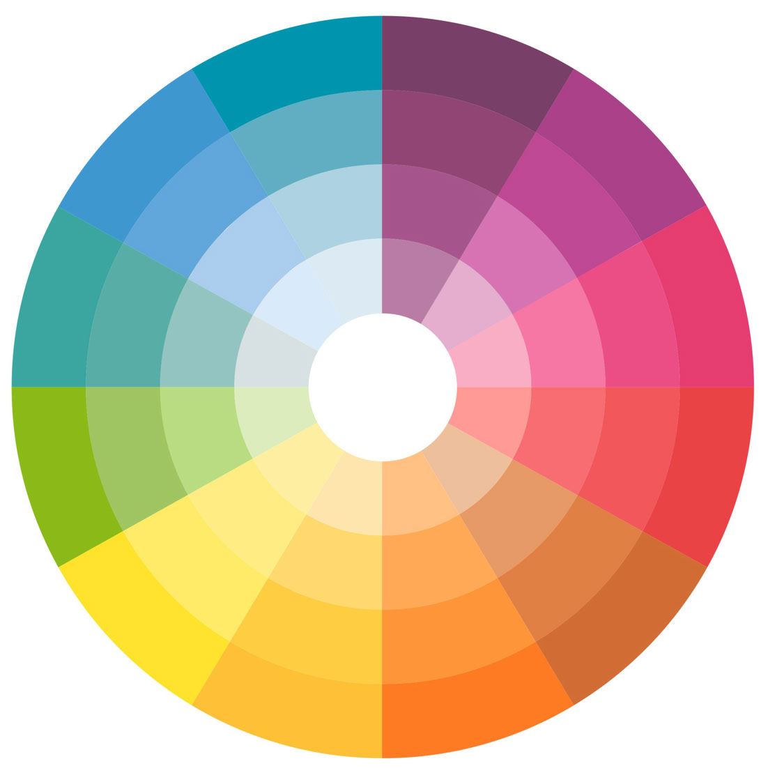
Understanding colour and it’s meaning.
Colours can trigger emotions, feelings and pre-determined assumptions about an object or company. Let us explain in a little more detail:
Red
Red is a bright, strong and vibrant colour, often associated with energy, power, danger and heat. It is often used to signify strong emotions, such as anger, romance (light red/pink) leadership, courage and love. It is quite an overpowering colour, and so should be softened, or used sparingly throughout logos or buildings, to avoid making other colours seem contrastingly lacklustre or dull.
Yellow
Yellow is often associated with joy, happiness, life, and enthusiasm. It is often used to signify life and creativity, with it’s strong ties to the sun, spring and summer. It evokes cheerful, jolly, feelings, and stands out without being too harsh on the eyes – for this very reason, it is often used in conjunction with other colours in warning signs. Yellow appeals well to children, and is often seen as a childish and slightly more feminine colour. Using it to brand prestigious high-quality products is not advised, although it’s standout quality would certainly catch the eye.
Orange
Orange is a delicate mixture of the happiness of yellow, the danger of red and a blend of the standout quality of both. It is often associated with joy, sun, tropics, sweetness, enthusiasm, happiness and creativity. It is a very warm colour, yet it carries far more subtlety than red. It is highly visible, yet not demanding.
Green
Green symbolises nature, growth, life and health. It has strong ties with being environmentally friendly, and safe. It is one of the most restful colours for the human eye and suggests stability and endurance. It’s a reliable and trustworthy colour and is often used to promote a similar strain of products and services, such as medical, environmental, or healthy items.
Blue
Blue is almost entirely dependent on the shade – light blue emulates the sky and the sea and represents a crisp, cool temperature and a calm and collected demeanour – a somewhat playful, childish, colour. Dark blue, on the other hand, represents knowledge, power, integrity and seriousness. Blue is one of the most variable colours and is often down to the interpretation of what you already know about a business/object. It can be serene or strict and serious.
Purple
Purple often implies stability, luxury and energy. Because of its association with royalty, it also symbolises nobility, ambition, wisdom and power. Purple is not often used to symbolise nature, as it can be quite a rare colour to find in nature, and is therefore not often used for environmental purposes. It is very popular amongst pre-adolescent children due to its rare and vibrant look.
Black
Black is associated with power, class, elegance but also death, evil and mystery. It is often associated with the unknown, or darkness. Despite the negative ties that come with black (black death, black hole, black humour) it is more often associated with mystery and class – black tie events, a clean black car etc. Black is often used to either make other colours stand out or to be a bold accent on top of a coloured background.
White
White is an angelic colour, often associated with light, purity, innocence and goodness. White is often used as a cleansing agent, to separate colours, or to infuse simplicity amongst branding. White is a modern, fresh colour, that is often contrasted with black to create bold statements and stand out.
What colours go well together?
Orange and Red
Yellow and Orange
Yellow and Green
Blue and Green
Blue and Purple
Red and Purple
Via thestylenote
Branding advice
Red: Creates a sense of urgency and importance and is often used in sales and impulse marketing
Green: Calming, relaxed and healthy, often used to project a sense of innocence, environmental awareness and relax people.
Blue: Represents trust and stability, often used by financial institutions like banks or building societies.
Navy blue: Represents a good deal, or cheap, and is often used when selling price-sensitive items to budget-savvy people.
Royal blue: Creates a sense of urgency and is also used when selling to more impulsive buyers.
Pink: Exudes romance, and often used when selling to women.
Yellow: A happy, attention grabbing colour which is used commonly in window displays or advertising to stand out without being harsh.
Orange: Offers up a sense of energy and life, therefore also used in fast paced impulse buying scenarios.
Purple: Calm, sturdy and mature. It is often used in anti-aging products or prestigious items.
Black: Puts forward a real sense of power or prestige. Often used to sell luxury products, or in aggressive marketing tactics.